Overview
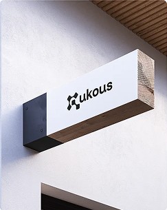
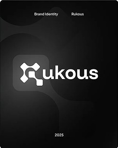
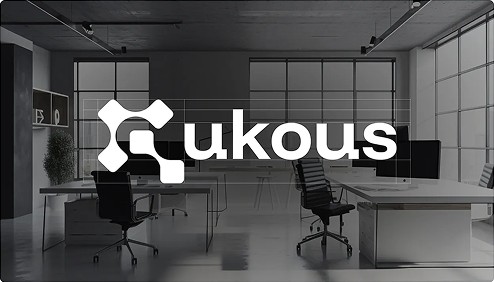
When we set up Rukous, we needed an identity that said two things at once: precise craft and steady momentum. The result is a mark built from rounded square nodes that connect into an R, one node for each service.
The challenge
Studio brands often fall into two traps: generic minimalism that says nothing, or decoration that dates fast. We wanted something simple enough to work at 16 pixels and distinctive enough to own on a wall.
What we did, day by day
- Day 1–2: positioning and a written brief for the studio.
- Day 3–4: three directions explored, from geometric to typographic.
- Day 5–7: the node-based mark refined and paired with a neutral grotesk.
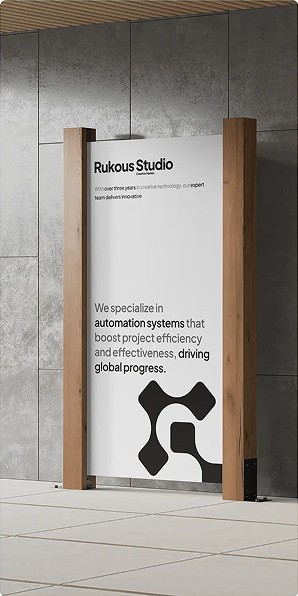
- Day 8–10: signage, stationery and environmental mockups for sign-off.
The result
4connected nodes, one per service
16pxsmallest size the mark stays legible
1monochrome palette across every touchpoint